
The Brief: Brad Frost on the magic of design tokens
This is a free issue!


In this issue of The Brief:
Design tokens FTW by Brad Frost
Job opportunities
Subatomic: The complete guide to design tokens
This post is an excerpt from Brad Frost’s new online course, Subatomic: The Complete Guide To Design Tokens. Use code DESIGNBETTERISAWESOME for 20% off.
Design tokens FTW
By Brad Frost, Design Better Expert in Residence and author of Atomic Design.
Brad Frost is a renowned design system consultant, front-end developer, and author based in Pittsburgh, PA. His methodology for creating and maintaining effective design systems, detailed in his book Atomic Design, has transformed how teams approach digital product design.
“DeSiGn SyStEmS KiLl CrEaTiViTy.” “DeSiGn SyStEmS MaKe EvErYtThInG lOoK tHe SaMe.” If I had a nickel for every time I heard that, I'd be writing this from a fancy beach-front bungalow.
There's a grain of truth to these cantankerous statements. Like all things in life, tradeoffs are involved when working with design systems. Compared to the freedom of a blank canvas, design systems introduce constraints. But relinquishing complete creative control yields a slew of benefits: more cohesive user experiences, higher-quality products, increased velocity, a shared language, a future-friendly foundation, materials to innovate, and more time & headspace to focus on more worthwhile tasks than rebuilding the card for the umpteenth time.
BUT! The grain of truth in these statements remains. Your digital product landscape doesn't look like this:

Instead, reality likely looks something more like this:

Organizations need to support many digital products, websites, apps, and software — each with its own unique goals, audience, constraints, opportunities, and design needs.
We’re under an immense amount of pressure to deliver more things to more people, to do it quickly, and to maintain exceptional quality. And that’s despite the landscape growing larger, more diverse, and harder to grasp by the minute. No pressure!
We find ourselves in a bind, needing both the efficiency, quality, & scale that design systems provide AND the flexibility and agency to meet each product's unique needs. Can we reap the benefits of using shared systems without forcing everything to look the same? Let's find out!
The Multi-All-The-Things Organization
For over 12 years, I've had the privilege of helping countless organizations wrestle with this dynamic and create/evolve design systems to power their multi-product, multi-brand, multi-framework, multi-platform, multi-generational, multinational, multimodal, etc organizations. We lovingly refer to them as “Multi-All-The-Things” organizations.
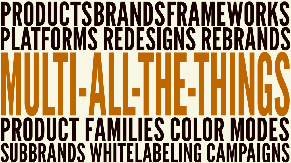
Every organization has to navigate its own unique Multi-All-The-Things landscape, which can include:
Multi-product - The overwhelming majority of organizations need to support two or more digital products with their design system
Multi-brand - Organizations like Marriott have multiple brands in their portfolio, each with a unique brand identity, audience, and visual language
Sub-brands - Companies like Apple support a slew of sub-brands (iPhone! Apple Music! MacBook! etc) that both inherit from the parent brand but also have their own distinct qualities
Rebrands, refreshes, and redesigns - There's a huge spectrum of brand/visual overhauls, from tiny tweaks to total transformation. If the redesign isn't currently in progress, I promise you it's coming!
White labeling & campaigns - Some organizations (think SaaS companies) need customers to insert their own branding and customize the interface, and other organizations (think e-commerce) need to customize UIs to support seasonal and one-off campaigns
Multi-product families - Many organizations support both marketing experiences (with big typography, chunky cards, and all the marketing fixings) and more utilitarian, functional enterprise software (with dense data tables, modals on modals, and other Capital-E Enterprise qualities)
Multi-modal - All design systems need to tackle the inverted/knockout color use case, but some organizations need to support dedicated color themes (hello, Dark Mode!)
Multi-framework - Many organizations support a dizzying array of web tech stacks: React! Angular! Svelte! Drupal! AEM! And users don't care that the homepage is powered by WordPress and the checkout is powered by Next; they just want a great, cohesive experience.
Multi-platform - Many organizations' technology diversity extends beyond the web and into native/hybrid mobile experiences, kiosks, PoS systems, dashboards, and more
Whew, that's a lot of stuff to wrangle! Each Multi-All-The-Things organization wrestles with their unique multiplicity, so the question becomes: is it possible to serve such a diverse digital landscape with a shared design system? Let's find out.
The New Separation of Concerns
Separation of concerns is a computer science principle that describes how each section of code should address a separate piece of a computer program. Web designers & developers of a certain age might remember the separation of concerns applied to the three languages of the web: HTML provides the structure, CSS provides the style, and JavaScript provides the behavior of a web page.
Let's talk about doors! Need one? If you did, you'd wander back to the door aisle of the hardware store and peruse the finite number of products on display. One may be a primed semi-hollow door, while another may be an untreated solid oak door. Both options adhere to standard construction dimensions, the hinges on positioned on either the right or the left, and the bored-out holes anticipate the door's knob and lock hardware.

A door's structure and the functionality are on full display in the door aisle. But you may notice there are no turquoise doors for sale in the door aisle. No pink doors. No orange even! For aesthetic decisions, we must wander over to the paint and door hardware aisles.

Hello, separation of concerns! The door's paint color and hardware finish — aesthetic decisions — don't impact the structural integrity and functionality of the door; these separate concerns come together to form the final (functional! beautiful!) result.
We need to apply our door metaphor to our wonderful world of pixels. Separation of concerns for the web can no longer be cleanly delimited between HTML, CSS, and JavaScript because "JavaScript don got big" (to use the parlance of the great Chris Coyier). The three languages of the web have advanced and new concepts & technologies have emerged; the lines are much blurrier.
But separation of concerns is still a great concept! After all, it would be ludicrous to require manufacturing a brand new door from the ground up every time someone wants an orange door instead of a lavender door. Unfortunately, that's precisely what we're currently doing in our digital work! Designers and developers often break away from established design systems for aesthetic reasons ("But our buttons need to be blue!"), and in the process lose all of the important structural, functional, and infrastructural benefits these systems provide.
We need a new separation of concerns. Thankfully, the brainy design systems community has already cracked the code. Our now-familiar component libraries — delivered via Figma team libraries, Web Components, React, Angular, et al — serve as our door frames, providing rock-solid structure, functionality, accessibility, UX, and front-end best practices.
But what about our digital turquoise paint and matte black hardware? Those aesthetic design decisions for color, typography, border, shadow, spacing, animation, and other UI properties are now defined and managed as a design token system.

Decoupling our structural component system from our aesthetic design token system creates the separation of concerns we need to address the needs of our Multi-All-The-Things organizations.
These complementary systems work together to create themeable design systems that can power multiple products, brands, color modes, tech stacks, product families, and more. The quickest way to get the point across is to show the tokens theme-switching magic trick in action:

Design tokens FTW
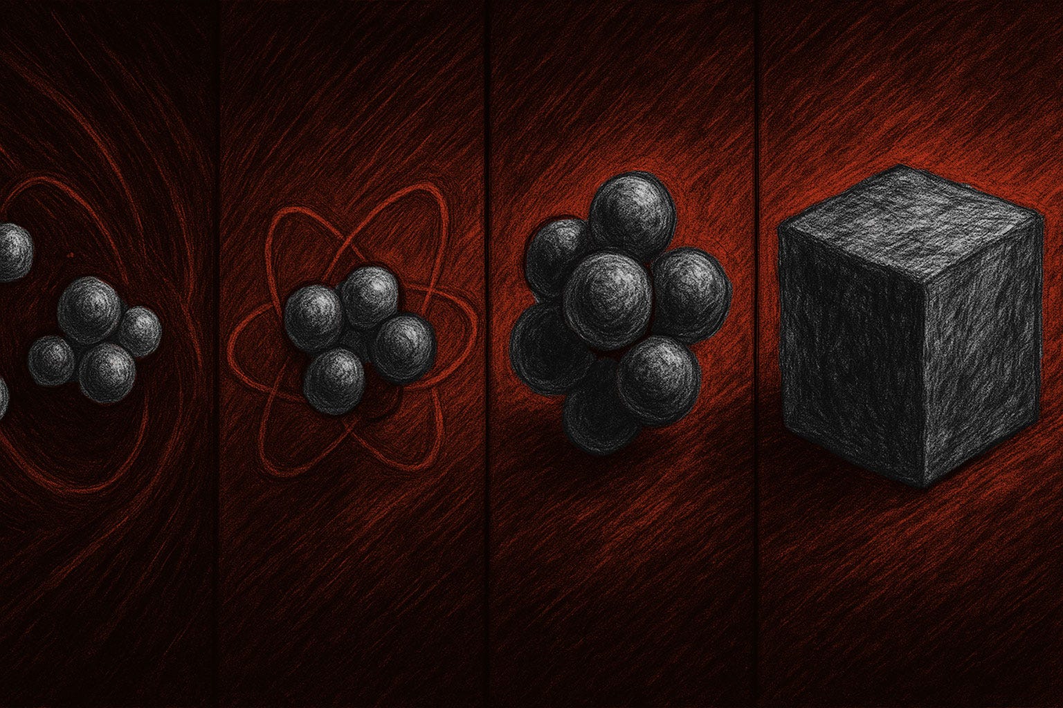
“Design tokens” as a term was coined by the Salesforce Lightning Design System team in 2016, with Jina Anne defining tokens in this way:
Design tokens are the sub atoms — the smallest pieces — of the design system. They're an abstraction of our UI visual design and store style properties as variables.
These style properties are defined as variables in design tools (like Figma Variables) and in code (stored as agnostic JSON and then converted to tech-specific formats using tools like Style Dictionary). Tokens serve as a design API that delivers a shared language to people, tools, and systems.
The benefits of design tokens are many. Reimplementing a design language across each and every digital product is manual, slow, fraught, painful, and expensive. A design token system introduces a connected source of truth that delivers design best practices to all products.

The ROI of establishing a token system is huge. Say a single button takes $50,000 to design, build, QA, integrate, deploy, and maintain. And say it takes $500,000 to create a button component powered by a design token system. Like any infrastructure project, it takes upfront investment to establish these systems, but the payoff becomes obvious as you multiply the number of buttons scattered across your org's digital landscape. It's the cost difference between manufacturing a brand-new door vs buying a new can of paint for each and every door you need.
SO, can we meet the needs of a wildly-diverse Multi-All-The-Things organization while also benefitting from shared system? With design tokens, you can!
I could go on and on about design tokens, and in fact I do in our new online course, Subatomic: The Complete Guide To Design Tokens! The course provides over 13 hours of in-depth videos, Figma & code sample token architecture, naming and governance workflows, a certificate of completion, and a whole lot more to help you master the art of design tokens.
Get 20% off Brad Frost’s Subatomic: The Complete Guide To Design Tokens. Use code DESIGNBETTERISAWESOME.