

The Brief: The Art of Noticing.
A guest post from James Buckhouse, Design Better Expert in Residence


Design Better is brought to you by Wix Studio, the most powerful web design platform for entrepreneurs, agencies, and creative thinkers. Learn more →
Art, Story, Design, & Film.
By James Buckhouse, Design Better Expert in Residence
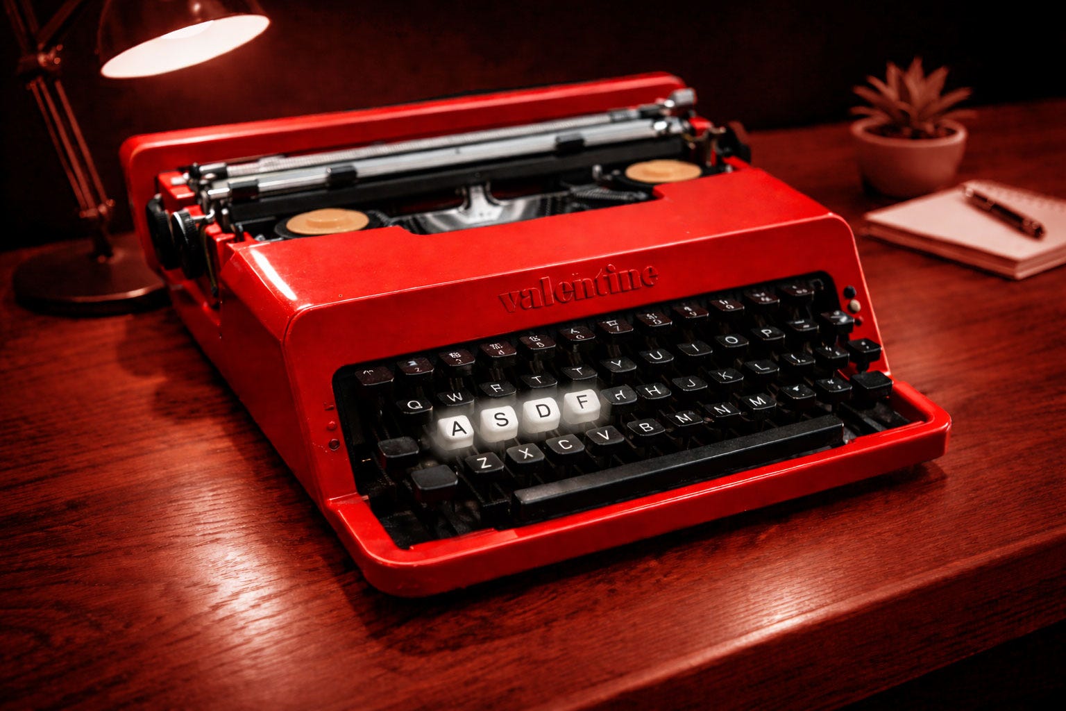
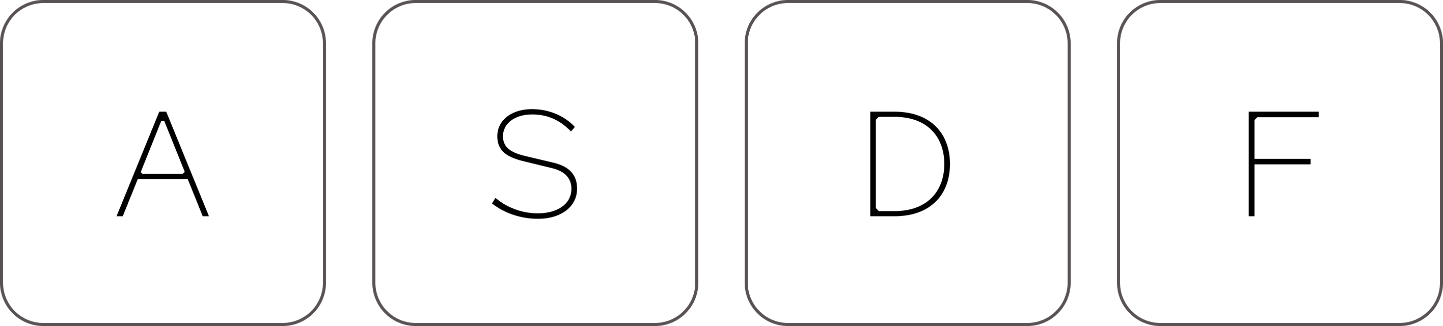
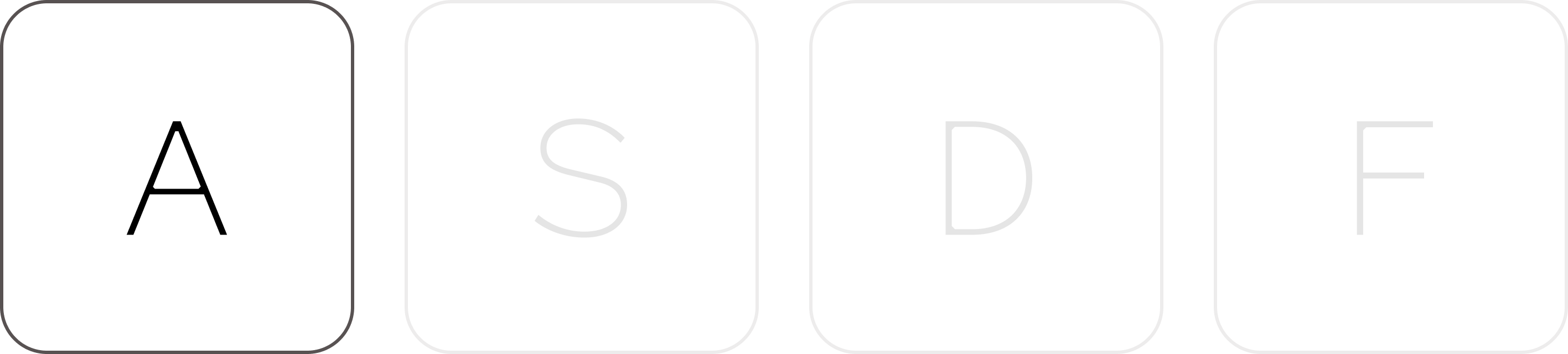
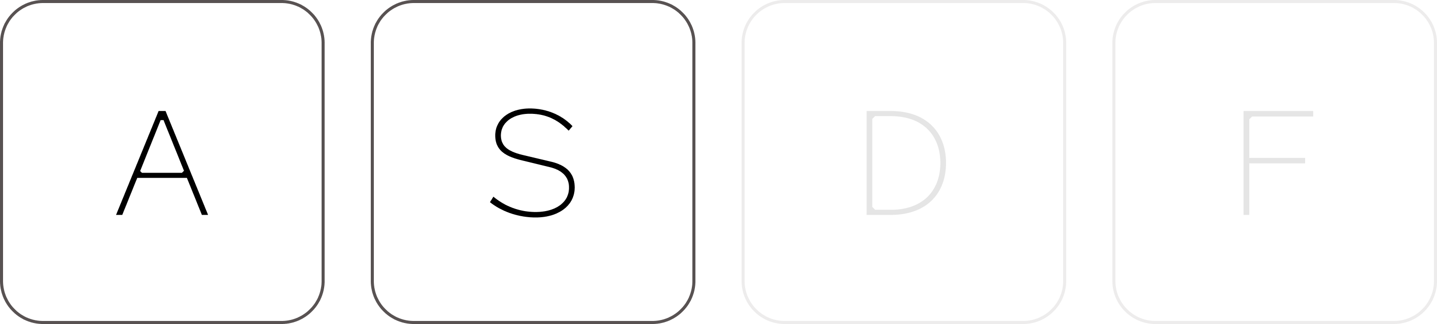
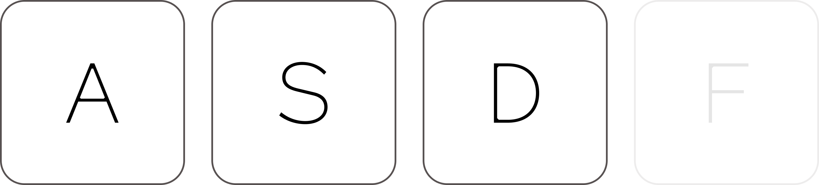
I parked my left hand on my keyboard and let my fingers strum the keys, marching from the outside towards the center to tap out the four-letter nonsense phrase asdf.
It’s an easy hand movement, a bit like playing the first few notes of the C-Major scale where your hand just does it without really thinking. It trills up the scale by raindropping one key after the next, naturally, easily, with a familiarity that is comforting.
The phrase asdf doesn’t really mean anything. It’s a little bit of digital jetsam that sputters off of your keyboard as you try to advance through some ungenerous UX that insists you give over some data before it will offer anything back.
It’s a useful placeholder where you can pretend to submit your required information without actually having to divulge your secrets. It’s fast and fun to type. asdf. Ritualistic nonsense.
And yet for some reason, just this one time, instead of seeing those letters as meaningless, I saw them as something else: a little message about my whole creative career so far: ASDF: Art, Story, Design, and Film.
Moments of Noticing: Art
Let’s examine moments of noticing in art, story, design and film, starting with art.
Most of representative painting isn’t learning brush control or applied chemistry (although there’s some of that), the main skill is noticing. Painters notice the form, the line, the color, the negative space, the shadows, and the light, and we do this in spite of our brain’s fantastic ability to pre-render, or pre-hallucinate, what it assumes we’re seeing instead of doing any actual looking. This comes from the fact that we can only see a narrow bit of our field of vision at a time, so our brains fill in the rest while our eyes are busy redirecting themselves around the scene. Once our language systems kick in, and we assign object-identifier names to what we register (cat sitting on couch or child on a bike), then we mostly stop actually seeing it, all while we think we are still looking.

An example… Here are four oil paintings of the same subject from slightly different angles. I did this minor act of insanity to practice my noticing; to render the familiar strange. To learn to foreground my assumptions and then reveal my lack of actual looking to myself so I could start to see and then paint.
It takes special effort to turn off our “pre-rendering” object-detection assumptions and actually examine the elements in front of us (and to do so with care). The brain knows so much that we think we already know what are we seeing without really looking and so we imagine what we already believe to be there. With effort, we can learn to see instead of assume.
How Low are Your Elbows?
Here’s an example from a beginning student’s journey into figure drawing: You “know” the form of the human body—and yet—without looking in a mirror or doing any calculations, or even thinking too hard, just blurt out an answer, if a person is standing up with their arms hanging down at their sides, about how far down are the elbows?
Most people immediately think: I know my elbows are in the middle of my arms which are on my upper body, so I guess it’s about half-way down my upper body so idk about halfway down my torso.
But the reality is bonkers.
Your upper arm is one of the longest bones in your body (after the bones in your legs). The upper arm hangs all the way down to to top of your pelvis. YES! What your tailor would call your natural waist!!!!
What ?!!?
Can you believe it?
But think about it. When you sit down your arms can rest comfortably in your lap. Your upper arm goes all the way down to your lap and your forearms extend from there. Your elbow is at your natural waist, or just above the top of your hips. Your hands dangle down much closer to your knees than your waist. Wow!
Doctors and trained artists aside, most all other people underestimate the length of the upper arm. The first mistake most people make when drawing the figure is to make the arms too short, or the legs too short, or the head too small, or the head too large. It takes real effort to actually notice something as familiar as our own body.
What color are shadows?
Another example: The next time you see a shadow, ask your self what color is it? Is it black? The non-noticing self say yes! Shadows are black! But look again.
If not black, then, are shadows grey? or some other color all together?
Look at the shadow, does it have blue or violet undertones? Or is it slightly orange or red? Does the color change at the borders? What is causing that color? What color is the light source? Is there any reflected light bouncing off of objects near it? What color do my eyes perceive it to be based on the colors around it?
The first time a painter a notices a shadow’s true color is a revelation. The mind melts. We are born anew. And then our mental model of color evaporates. Newton used a prism to dissect white light into individual colors. Goethe examined how color is only experienced via our perceptions, not in some ideal state.
All of this is complicated by the fact that the same ideal “colors” appear to us differently depending on the relative simultaneous contrast of the surrounding colors. In other words, our brains understand color in relation to other colors, not as absolutes. Wild.
Serious noticers like 11th century physicist Ibn al-Haytham, Johann Wolfgang von Goethe in 1810, Johannes Peter Müller in 1838, all the way to Albers in the 1950s, dug into this curious aspect of the perception of color. We experience color differently, depending on the colors around it.
The next time you look at a painting, or something that might be an interesting subject for a painting, examine your own noticing.
Moments of Noticing: Story
Non-fiction writer and literary critic (and Harvard prof) James Wood posits that noticing is also at work for writing. His two most famous collections, How Fiction Works and Serious Noticing both make the case for examples from literature where the author’s ability to notice some aspect of humanity is the nidus of great work. Noticing, for him, is the nest, the seed, the source. The art is enacted both in the selection of details the writer includes and what truth those details expose. In a way, this post is a tribute to his two books. Here’s an excerpt from How Fiction Works.
“When I talk about free indirect style I am really talking about point of view, and when I talk about point of view I am really talking about the perception of detail, and when I talk about detail I’m really talking about character, and when I talk about character I am really talking about the real, which is at the bottom of my inquiries.”
James Wood, How Fiction Works
James Wood shows us how to notice details in great writing where an author can gently nudge a seemingly removed, impartial “third-person” description of a moment either towards or away from a specific character’s point of view. An author can slip us towards a character’s understanding of the world, or retreat to a seemingly neutral state, or move towards a new character’s view all by deploying small changes to the style of the third-person description and the choices of details described. Style is an interesting term to use here—because we think of an author having a style or voice, but whose voice is it really? The character’s? The non-character-third-person narrator’s? or the author’s? Or the language of the world created by the fiction? Wood makes the case that it is often all of the above, and our we find our way through by noticing the details, observing the choices, and delighting in the subtle shape-shifting as we embody different fictional minds all while also perceiving the world through the author’s orchestration (and vision) as she or he tells us where to look and teaches us how to see.
Look at the Fish
Novelist Robin Sloan (Mr. Penumbra’s 24-Hour Bookstore, Sourdough, Moonbound) has a “tap essay” called fish. https://www.robinsloan.com/fish/
You read the essay by downloading an app Robin wrote and tapping through one page at a time. The story progresses along a bit like a 80s-era text adventure game, revealing only the smallest amount with each new tap, in the same way a cautious house guest might walk down unfamiliar stairs at night with no light.
If you haven’t experienced the essay first hand, I won’t ruin it here. But at its heart is the idea of looking closely, deeply observing, and learning to notice. It takes only a few minutes to read, so please enjoy. There is a something lovely waiting there for you.
Text Boxes on the Internet
Robin and I worked together early days at Twitter, where we were thinking about networks, distribution, and story. Oral tradition, papyrus scrolls, manuscripts, printed books, newspapers, magazines, blog posts, Tweets…
Images: Robin Sloan (now) and me (back then).
While co-founder Jack Dorsey has become the face that materializes in most people’s minds when they think of who founded Twitter, the spirit of co-founders Ev Williams and Biz Stone were always there as well. Ev founded Blogger, Twitter, and Medium. In many ways, Ev has been the main through-line in the democratization of text on the internet. In the best light, Ev’s products all came from a place of hope to give a voice to the under-heard.
Blogger was long form, Twitter was short. And Medium was, well, medium. This isn’t the whole story, of course, there’s more to each product and platform, and yet all three products managed to do a lot of work with a simple text box.
When I first saw Robin create his Tap essay, I could sense him exploring what it means to seek new forms for text on the internet. This was not a condemnation of the text box, but instead a moment of recognition of priors and an act of curiosity and bravery. It makes me want to be just as brave. To design for transformation at every level.
Moments of Noticing: Design
Ask a UI/UX/Product/Software designer about their job and they will usually talk at two levels: one is a high-level story about the transformation of the user that involves the flow of the product from some initial state to a desired result. The second is at the level of all the tiny details. These tiny differences are noticed by designers and are mostly just “felt” by everyone else, even if they can’t quite tell you why a design feels nice or clean. The choice of typeface, the space between letters, the space between lines of text, the alignment to a grid, the breaking of a grid, the harmony of color, the elegance of a smooth button state transition, the dynamic resizing of content and layout… all these details add up to the craft of design. Designers care deeply about these details, it’s a shared, private language of excellence.
So what happens when we are no longer the ones to actually make these choices? What happens when Claude or OpenAI or some other model looks at all the existing react components of the public web and makes all the choices for us and, well, they are actually pretty good? What happens in a few weeks or months or years when those choices are actually truly excellent? Let’s pretend for a moment that this will happen—that AI will be able to design brilliantly, now what?
Options:
We become “Art Directors” and tell the app how to adjust it’s own design, but we mostly stay in our lane as designers. Adjusting padding with a prompt. Reminding the LLM to go look at the react repo. Offering suggestions like “add more white space”
We become “Product Directors” and take over the responsibility to guide the product, design, and front-end engineering for the project to see it all the way from idea to being fully built and shipped. We dream, then build.
We become “Creative Directors” and dream up new styles, directions, vibes, juxtapositions, complications, affordances, influences, and possibilities to drive culture forward. This is the important part —> We drive culture forward.
I like a combo of 2 and 3. Creative Directors who build their ideas. Cultural scouts, ahead of the curve, dreaming up the future and then making it. We ship our dreams. Where we both dream up the future of culture AND build it.
Back to Noticing…
Which brings me a moment of serious noticing in traditional design. Sequoia’s brand uses three typefaces: Unica77, Rosart, and Pitch. These three are our brand-specific choices in the classic type-triangle of ▲ Sans, ▲ Serif, and ▲Mono. The type-triangle is pretty standard: your sans might be Geist or Inter or Helvetica or Gotham. Your serif might be Georgia, Baskerville, or Garamond. Your mono might be Space Mono, Courier, or any other mono really. We chose Unica77, Rosart, and Pitch, but your team might choose something else.
Now here comes the moment of noticing: our mono was picked to be used for UI labels or those tight little all-caps “eyebrows” that serve a section headers to break up a wall of text. This was already a detour from the norm, as Pitch was originally designed as to evoke a “typewriter” feel, like Courier. The name references a screenwriter’s use of Courier, the standard typeface for pitching to studios. The idea was to create a well-built typewriter font for the digital era. See it at Klim Foundry. https://klim.co.nz/fonts/pitch/
At first we used it instead as an accent font, instead of body copy. But then Sequoia Designer Andreas Weiland noticed the details in the face—those little welds in the corners—and he started blowing it up and using it as a display face. WHAT?! and at these giant sizes, the welds become architectural. They become trusses on the Golden Gate Bridge. They become the brackets and wooden beams exposed on the Gluckman lofts of NYC galleries in the 90s. They become the support that holds the grid together. They become the invisible hand of help behind the scenes. They become metaphor. They become poetry.
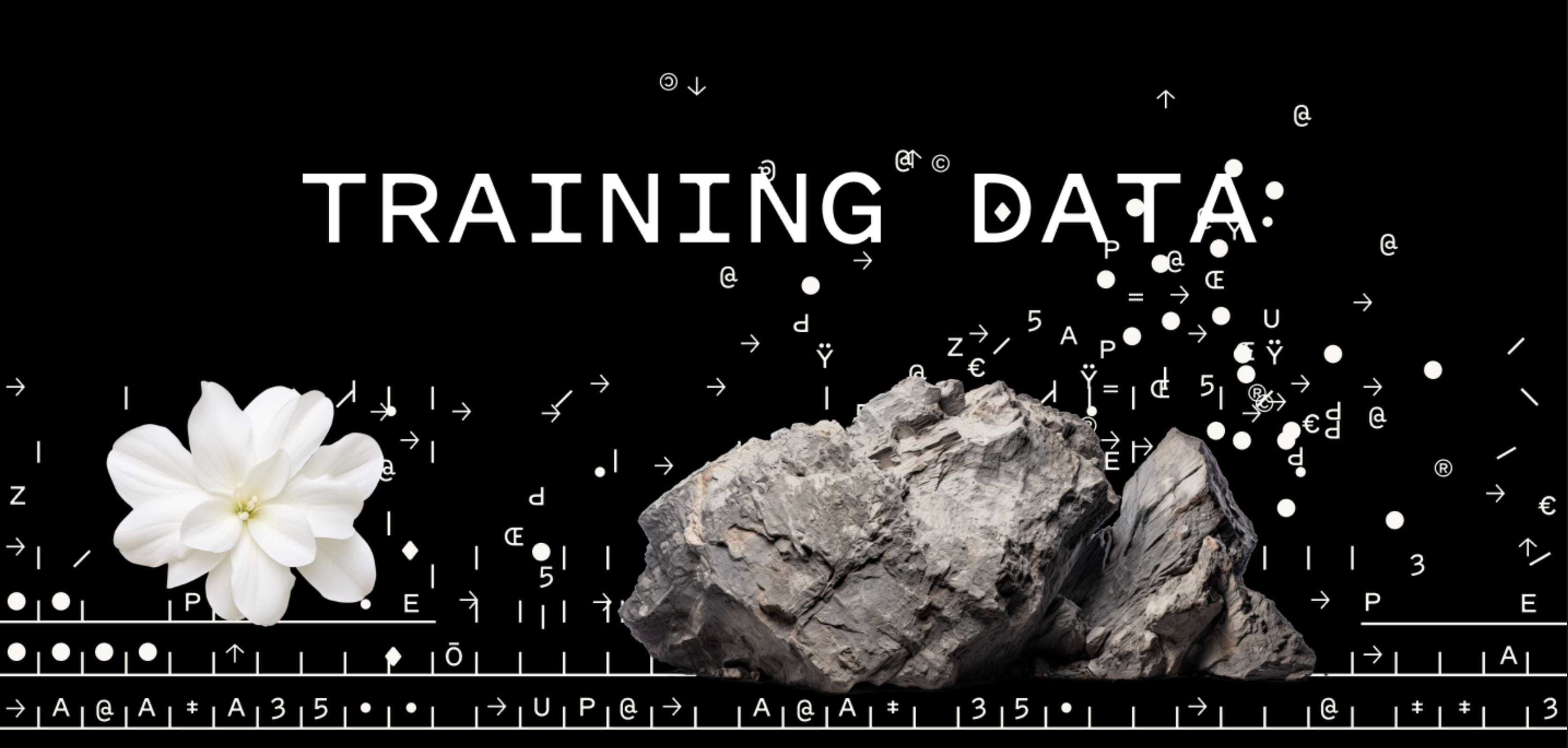
Here is one example of Andreas using Pitch as both a Display face and as a more typical UI label text (although in this case, it’s animated for a video intro). This image is also a good example of the Creative Director vibe who creates culture… think of this unexplained combination: that rock. that flower. that broken grid of text. We feel the vibe, we believe. We understand the weight and the delicacy, even if we can’t tell you for certain what the flower and rock “mean” in any coded symbolic or allegorical sense. We can pretend to know, but we don’t really know just by looking. But also… we do know. We feel it. We vibe it out. We understand. Delicate and non-deterministic. Weights and biases. A changed world.
See more of Andreas’s designs here: https://sequoiacap.com/series/training-data/

Moments of Noticing: Film
I got my start making movies, working on the Shrek, Madagascar and The Matrix series. Filmmaking was a practical education in hands-on creativity.
For today, I want to talk about a moment of noticing that will change how you see film. It will take you from a person who merely watches film to one who sees the invisible string that holds the whole endeavor together.
It’s a bit like when you realized almost all classic physics comes down to F=MA. It’s called the 180 degree rule. And it’s the biggest thing missing from today’s AI video models. Let’s break it down.
AI is good at generating images. It’s also good at generating videos. What it is not yet good at is creating a series of shots. Cinematography applies to both at the shot and at the sequence level. Cinematography is the composition of a single shot AND the orchestration of lots of shots collected together to move the audience through the scene.
You might have an establishing shot to show the audience where you are. Next might be a mid-body close up to establish which character is in this scene. You might next get a series of close-ups, two-shots, over-the-shoulder shots, tracking shots, etc. as we progress along with the action. Holding all of this together is the 180 degree rule. It tells the audience where the characters are in space and in relation to each other.
Here is a page from the classic filmmaking text book, Shot by Shot.

The 180 degree rule, or line of action rule, is what keeps the audience floating along with the bliss of the suspension of disbelief in the cinematic apparatus. When it unintentionally breaks, and the edit bumps, we feel the jolt of artifice, we feel that we are watching something constructed. We no longer get to inhabit the waking dream of cinema.
And yet… AI video generators mostly just make individual shots. It’s up to the prompter to make sure that for each next shot, you are placing the characters in the correct configuration for the line of action. You can’t just say “wide shot” you need to describe where the characters are in space and on the screen. Here are a few techniques:
Options:
Describe the locations of the characters both in space, describe the location of the camera, then describe the shot elements in terms of Screen Left and Screen Right.
Use a placeholder drawing or image to show the position of the characters as input to generating the characters.
Explicitly talk about not breaking the 180 degree rule in your prompt. Describe the set-up and tell it to follow the rule.
Use a top-down diagram in your prompt to describe where everyone is in the shot.
Study the 180 degree rule and you’ll start to watch TV and movies differently. You’ll start to deduce the location of the camera. You’ll start to notice the invisible line of action connecting the characters. You’ll start to notice that the characters are almost always looking a little (or a lot) off to one side or another. You’ll start to notice the hidden architecture of cinematography at work in shot construction. With a little practice, you’ll be able to start to pick out wide and flat lenses. You’ll start to notice f-stops and depth of field. You’ll start to see the choices made that everyone else just feels. You’ll be able to notice the choices that make all the difference. This is a new kind of pleasure when watching film—the joy of seeing the brilliant, ingenious, poetic choices made every step of the way.
Thanks for reading! You can find me at Outsider Insight, my regular Substack below. Please reply with your own moments of noticing in story, art, design, film or any other field. I’d love to hear from you.
Things to read, watch, and explore
Ellie Grace, who is our wonderful producer and engineer Brian Pake’s daughter, just came out with her first album, check it out below!
 | A guest post by
|
Thanks for reading! What is something you've noticed that most people miss? What's a favorite detail about something you love? Have you ever looked closely at something and suddenly saw more—long after you were sure you had already seen everything there was to see? I'd love to hear your moments of noticing.