

The Roundup: 6 Principles for Designing Pricing Pages That Convert
Drawn from our conversation with Etinosa Agbonlahor, behavioral economist and founder of Decision Alpha


We recently had behavioral economist Etinosa Agbonlahor on Design Better, and partway through the interview, we made the mistake of asking her to critique our own membership page live on air. The feedback was a little uncomfortable (in the best way). 🥹
Etinosa spent over a decade at Fidelity and Commonwealth Bank studying how people make financial decisions before building Decision Alpha, a consultancy that helps companies turn pricing into a growth lever. Her framework for pricing draws on behavioral economics, the field that sits at the intersection of psychology and economic decision-making. The principles she laid out for us are a treasure trove for anyone designing a pricing page.
Some of what she described in our interview connects to a broader body of research worth knowing. Two names that come up repeatedly in this space are Daniel Kahneman and Amos Tversky, whose Prospect Theory established that humans don’t evaluate prices in absolute terms. We evaluate them relative to reference points, and we’re far more sensitive to losses than to equivalent gains. Their work earned Kahneman the Nobel Prize in Economics in 2002. If you’ve never read Thinking, Fast and Slow, Kahneman’s accessible summary of a career’s worth of this research, it belongs on your shelf .
Here’s what Etinosa taught us, with some of that broader research woven in where it adds context.
Listen to the episode and join the conversation
Etinosa Agbonlahor: Spotify, Apple Podcasts, Substack
Already a paid subscriber? Follow this link to set up you premium feeds on Apple, Spotify or any other platform from your phone or computer.
Join the conversation about this interview in our chat room. →

Design Better is brought to you by Wix Studio, the most powerful web design platform for entrepreneurs, agencies, and creative thinkers. Learn more →
We ❤️ Wix and we know you will too!
The core insight: nobody evaluates a price in isolation
Kahneman and Tversky’s reference-point theory is the engine behind almost every principle below. People don’t look at a price and ask “is this reasonable in absolute terms?” They ask: reasonable compared to what?
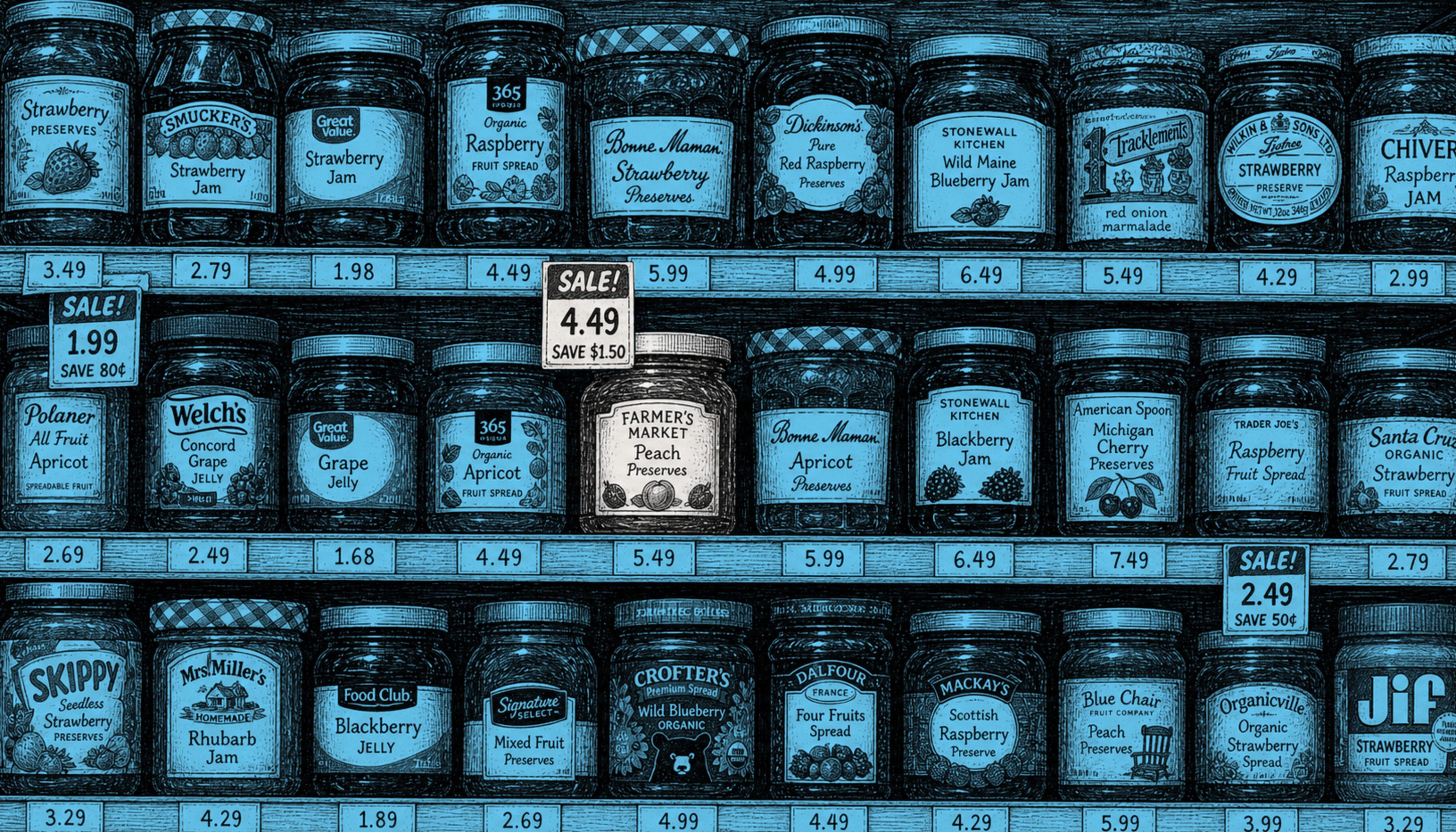
A $10,000 raise feels great until you learn everyone else got $20,000. A $27 bucket of popcorn seems moderate the moment it’s sitting next to the $35 one. Your job as a designer is to control what reference point the customer encounters first — because that context shapes everything that follows.
1. Don’t make “yes or no” the question. Make it “which one.”
When you present a single price, you’re asking your visitor to make a binary decision: pay up or leave. The moment you introduce tiers, you reframe the decision entirely. Now they’re choosing how to work with you, not whether to.
This connects to a phenomenon Kahneman and Tversky described called the disjunction effect — people under uncertainty tend toward inaction, even when action would benefit them. A single price creates that uncertainty. Multiple options create movement: the visitor is now deciding between things, not deciding whether to decide.
Etinosa put it directly: “It’s going to change the decision from a yes or no to which one.”
Design principle: Even if your product has one primary tier, consider what you’re putting around it. A free tier below, an enterprise option above — both shift the visitor from hesitating to choosing.
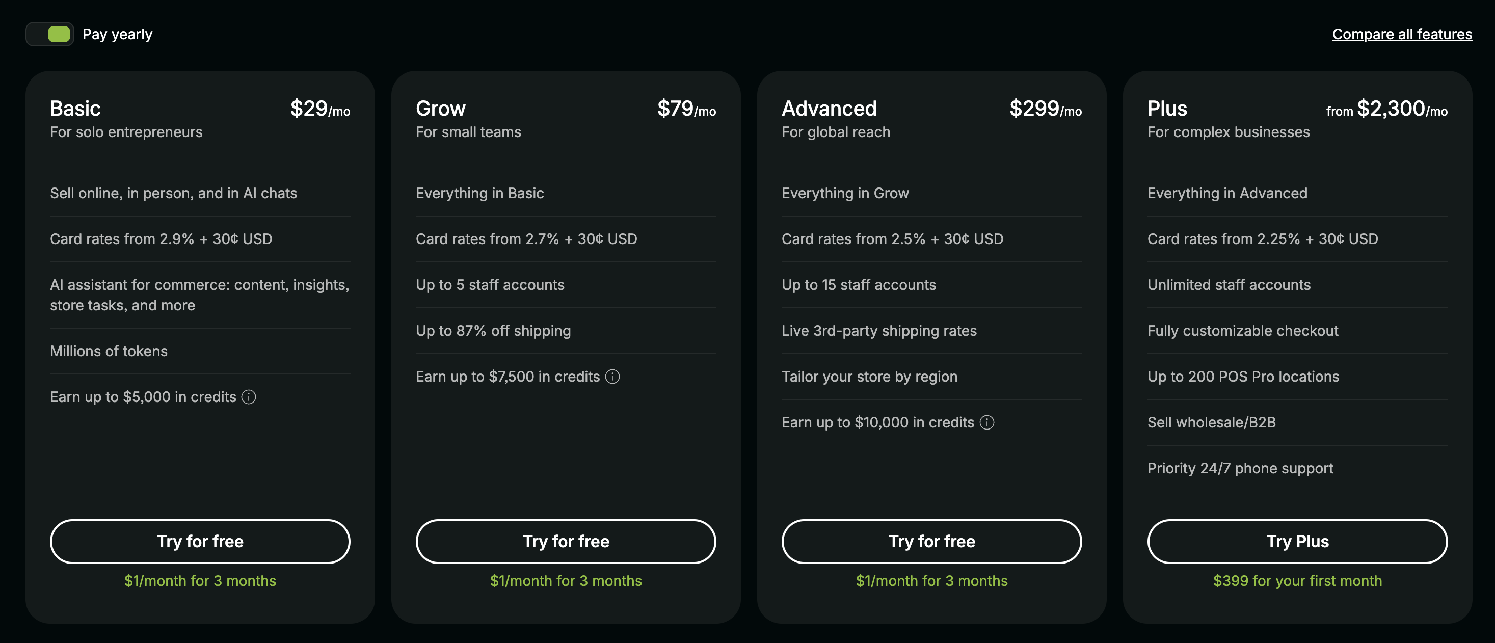
2. Use the decoy to make your target tier feel inevitable
The decoy effect — also called the asymmetric dominance effect — was first formally studied by researcher Joel Huber at Duke in the early 1980s, and it’s one of the most durable findings in behavioral economics. Introduce a third option that’s deliberately unattractive, and it makes one of the other options look dramatically more reasonable by comparison.
