The Roundup: Design history in jazz records
How great music inspired great design.


Years ago, two friends in Philadelphia went looking for a parking lot. They’d been staring at the same six words on the back of their favorite jazz records for years — recorded by Van Gelder in Hackensack, and one Saturday they drove out to find it. They tracked the address down in a 1955 phone book. They pulled up expecting something. What they found was a parking lot for Hackensack Sports Stadium. No sign. No plaque. Nothing to mark that Rudy Van Gelder had turned his parents’ living room into a recording studio and quietly helped capture some of the most important American music of the century.

Chris Entwisle and Mark Havens had a quiet ride back down the turnpike. It’s also the reason WAIL: The Visual Language of Prestige Records exists. Unlike Blue Note, Prestige never got its design mythology — despite cover art that’s just as striking and just as durable. Entwisle and Havens spent two decades tracking down original pressings and interviewing designers before that history disappeared for good, and what they found was a label that ran, in one historian’s words, “like a mom-and-pop store” with no budget, no briefs, no marketing department and somehow produced a visual identity coherent enough to still echo through design today.
If you find yourself wanting for a fresh approach to your work, the Prestige record catalogue is a treasure trove of inspiration on how to use color, typography, and imagery in innovative ways.
Listen to the episode
Chris Entwisle and Mark Havens: Spotify, Apple Podcasts, Substack
Already a paid subscriber? Follow this link to set up you premium feeds on Apple, Spotify or any other platform from your phone or computer.

Join Eli and Aarron September 28–29 in Sonoma for the September Work(shop) Leadership Excursion — an intimate, conversation-first gathering of forty design leaders in the heart of wine country, built to challenge how you think about your craft and the coalitions behind it. Only a handful of tickets remain — see the lineup and reserve your spot.
1. Nobody was hired to be a graphic designer
Let’s start with who these designers/artists actually were, because none of them set out to make album covers. Reid Miles trained at Chouinard and wanted to be an art director. Tom Hannan studied under Hans Hofmann and considered himself an abstract expressionist painter first. David X Young came to New York from Cape Cod to paint alongside Franz Kline and Willem de Kooning at the Cedar Tavern. Esmond Edwards was a freelance news photographer who talked his way into a session by offering to drive the musicians out to New Jersey.
Bob Weinstock, the label’s founder, didn’t have an art director because he didn’t have a staff to spare one. His hiring process was a portfolio and a hunch. “Tom Hannan just knocked one day and said, ‘Hi, I’m an art director,’” Weinstock remembered. “Bob Parent was a jazz photographer who was always hanging around. Whenever you needed a picture, you’d go to him.” There was no brief, no comp, no client approval — Weinstock vetted everything the same way, whether it was the music or the cover art. “I viewed it all as art,” he said, “the music and the covers.”
Prestige had none of that scaffolding, and it produced Esmond Edwards — a self-taught photographer who became, in Entwisle and Havens’s words, the label’s de facto creative director simply because he kept showing up and getting better.
“I viewed it all as art—the music and the covers.”
—Bob Parent
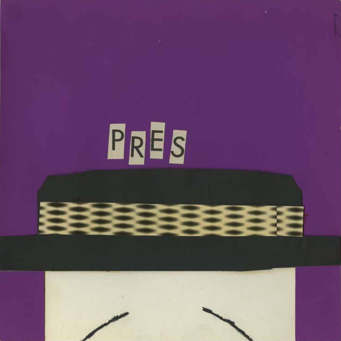
That freedom produced work that never even got the label’s blessing. David X Young — a Cedar Tavern painter who ran a jazz loft in the Flower District before he ever touched a record cover — designed this portrait of Lester Young for a rival label, Clef Records, using cut paper and a single word. It was rejected. Entwisle and Havens tracked down the original artwork decades later; it had never been printed.
The absence of a house style wasn’t a failure of management. It was the whole point. Each designer’s background — painter, photographer, sign-maker’s son — shows up directly in the work, because nobody was hired to execute someone else’s system. They were hired to have a point of view.
2. Limitations created opportunities
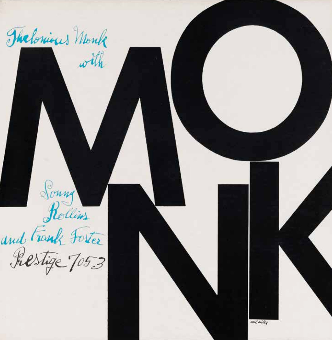
Reid Miles wasn’t even a jazz fan and he said so himself. What he loved was the blank 12-by-12 canvas and the fact that Prestige couldn’t afford to pay for art. “I only had type to work with,” he said, “and being a good designer, I guess I took advantage of the opportunity.” The result was the Thelonious Monk Quintets cover: the word MONK, split across two lines, filling the entire square in black type so large it reads as pure shape before it reads as language.