



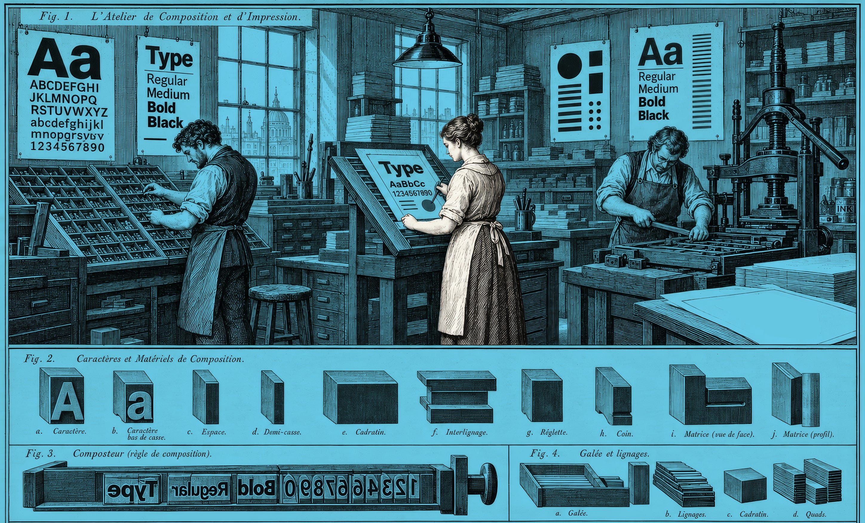
I began my career in physical product design, and apart from a few introductory studio design classes I took while studying product design as an undergrad (in what was technically an engineering major), I didn’t have much grounding in typography or graphic design.
Over the years I got more interested in it, and picked up books like Ellen Lupton’s Graphic Design: The New Basics. But it wasn’t until I decided to start an underwater photography magazine with a friend that I challenged myself to approach it more professionally.
By the time we went to print with the first issue, I was confident that the results were, as Larry David might say, pretty, pretty good. How wrong I was.
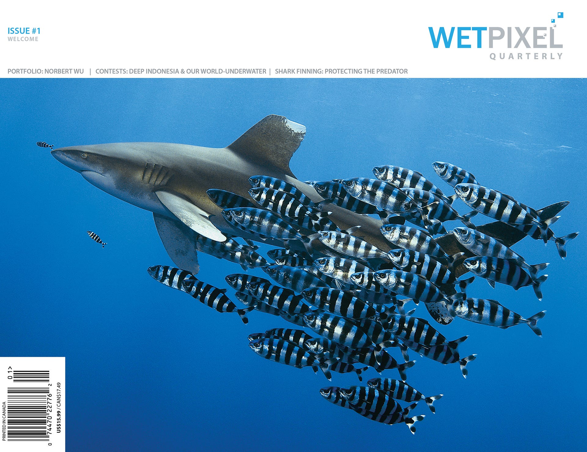
After sharing the print version with a friend who had studied graphic design in college,1 he pointed out several fundamental errors I’d made in typography and layout. First of all, the text across the columns wasn’t aligned to the grid. There were several other noob mistakes, but the one that, in retrospect, was the biggest missed opportunity was my choice of typefaces.
I ended up using what were essentially some of the default options in Adobe’s InDesign (Minion Pro and Myriad Pro). Not terrible, but not especially unique or creative either. Perhaps the equivalent of the non-offensive invitation your great aunt might send out for her dog’s 15th birthday. By the final issue, the design and layout had gotten better, but I’m sure there are still plenty of mistakes that better designers than me would point out.
In later years, as I continued to do graphic design work for clients both in print and on the web, I learned about resources like Jonathan Hoefler’s site (now Typography.com), which offered lovely type pairings.
Fast forward another few years, and we’ve been lucky enough to have some of these typography legends on Design Better: Ellen Lupton, Jonathan Hoefler, and most recently, Tom Foley.
In this issue of The Roundup, we’ll explore what we learned from these experts, and what you might apply to your own design practice, whether you’re a beginner, intermediate, or expert.
Tom Foley: How to pair typefaces and why the best brand fonts go unnoticed

Tom Foley didn’t set out to design typefaces. As a postgraduate student at Central Saint Martins in London, he was researching why Ireland, unlike Switzerland, the Netherlands, or Germany, never seemed to have a confident typographic voice of its own.
Listen to the episode
Tom Foley: Spotify, Apple Podcasts, Substack
Already a paid subscriber? Follow this link to set up you premium feeds on Apple, Spotify or any other platform from your phone or computer.
1. Pair by structure first, personality second
Most of us pair type by what we’ve seen before—a vibe we liked: I dig how this designer paired this serif with this sans. Tom’s advice is to ignore the vibe for a minute and look at the skeleton.
“There’s some really good principles that can make it a lot easier,” he told us. “And they’re actually looking at less expressive stuff and more structural things.”
One test is ancestry—tracing each typeface back to the tools that shaped it:
“Say you’ve got a serif headline typeface and it’s a modern or a Bodoni style, so has…high contrast, and the shoulders blend into the stems and it has fine serifs. That typeface model, that modern model, eventually evolved into grotesk typefaces… So those typefaces always pair better with grotesques because they have the same structure.”
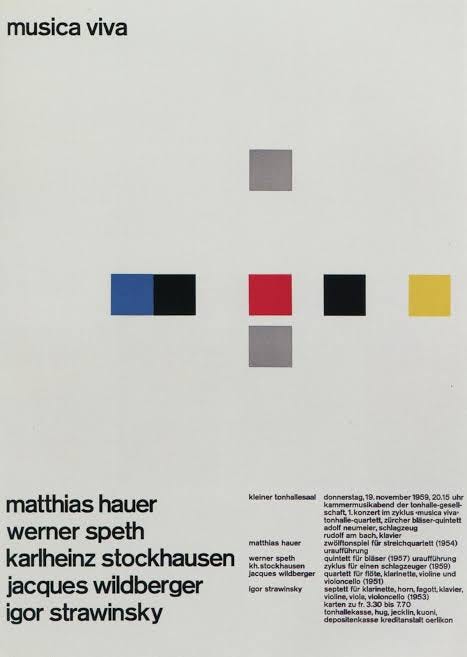
In other words, ask “what structural aspects of this typeface have come from which calligraphic tradition? Broad nib or pointed nib.” For a deep dive on that idea, Gerrit Noordzij’s The Stroke: Theory of Writing (1985) is the source of the “translation versus expansion” framework Tom alluded to.
